How Color Choices Affect Whether People Trust Your Website
Color triggers an emotional response before anyone reads a word. Healthcare needs blues and teals for trust. Wellness needs warm earth tones for safety. The wrong palette drives people away before they know why.
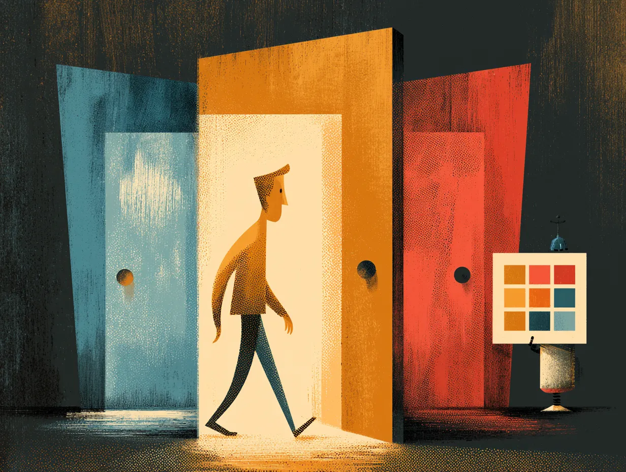
A visitor to your website makes a trust judgment within seconds, before reading a single word. Color is the primary driver of that judgment. Choose the wrong palette and you create a subconscious feeling of unease that no amount of good copy can overcome.
Different industries demand different color associations. Healthcare and dental practices need blues and teals, which signal trust and clinical competence. Wellness and therapy need warm greens and earth tones, which signal safety and calm. Law firms need deep blues and grays for authority. Financial services need navy and gold for stability.
The relationships between colors matter as much as the colors themselves. Monochromatic palettes (variations of one hue) feel calm and cohesive. Complementary palettes (opposite sides of the color wheel) create energy and contrast. Analogous palettes (neighboring hues) feel harmonious and natural.
One universal principle: pure black text on pure white backgrounds creates harsh contrast that fatigues the eye. Near-black on off-white (cream, warm gray) creates the same readability with significantly more warmth. This single adjustment makes any site feel more professional.
Topics
Want to see these systems in action?
Start with a conversation. We will walk through how these workflows apply to your business.
Get your AI Roadmap