The Hero Section Pattern That Builds Trust Instantly for Service Businesses
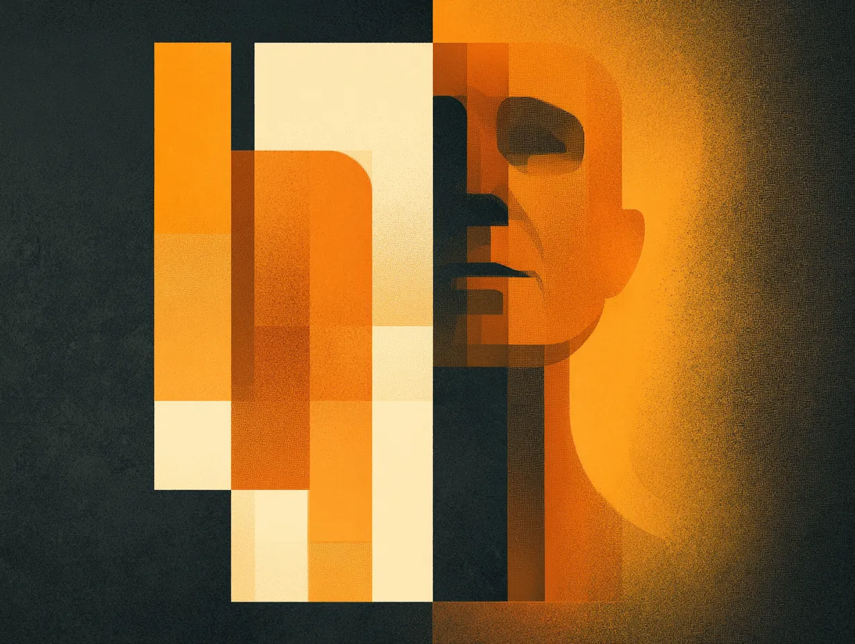
A two-column hero with a photo fading into the background creates warmth and professionalism. This pattern works especially well when your business depends on personal connection.
For service businesses (therapists, consultants, lawyers, dentists), the first impression is personal. Visitors are evaluating whether they want to work with you specifically. A hero section with a stock photo of a handshake or a generic city skyline does not build that connection.
The split hero pattern puts text on one side and a photo of you (or your team) on the other, with a gradient fade that dissolves the image into the background. The person appears to emerge from the page rather than being trapped in a box. The text gets clean space to communicate your value proposition without competing with the image.
Key craft details: the subject should face toward the text (flip the image if needed). The background should match your site's base color so there is no visible boundary. A subtle grain texture at low opacity adds depth without being noticeable.
The known vulnerability is mobile. The image that works beautifully on desktop must not disappear on phones. Design the mobile hero deliberately: place the image above the headline, or use it as a higher-opacity background. Never let responsive CSS accidentally erase it.
Topics
Want to see these systems in action?
Start with a conversation. We will walk through how these workflows apply to your business.
Get your AI Roadmap