Why Every Section on Your Website Looks the Same (and Why That Is a Problem)
If every section follows the same layout pattern (heading, description, card grid, repeat), visitors start skimming by the third one. Your pricing and team sections lose impact because nothing stands out.
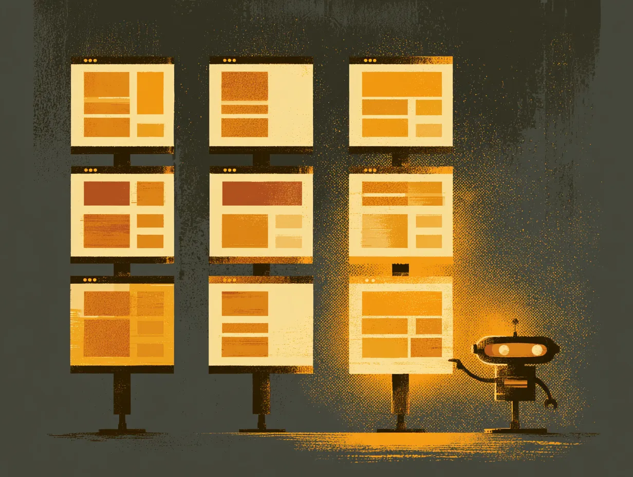
Pull up your website and scroll through it. If every section uses the same structure (a small label, a large heading, a description, then a grid of cards), your site is predictable after the third section. Visitors shift from reading to skimming, and your most important sections like pricing or testimonials lose their impact because they look identical to everything else.
Visual rhythm needs variation to maintain engagement. Alternate your column count (two columns, then full-width, then three columns). Change your background treatment across sections. Break the vertical flow with a horizontal element like a timeline, a stat strip, or an image band.
The goal is not visual chaos. It is strategic variety. Each section should feel intentionally different enough that the visitor knows they have arrived somewhere new, while still feeling like part of the same coherent design.
Topics
Want to see these systems in action?
Start with a conversation. We will walk through how these workflows apply to your business.
Get your AI Roadmap