Why Your Website Looks Bad on Phones (and How to Fix It)
60 to 70% of your visitors are on their phones. If your website is just the desktop version stacked vertically, the majority of potential clients see a broken experience.
Pull up your website on your phone right now. If the text is tiny, the images disappear, the buttons are too small to tap, and you have to scroll through 14 screens of content, your mobile experience is broken. And with 60 to 70% of service business traffic coming from phones, this is not an edge case. It is the primary experience for the majority of your potential clients.
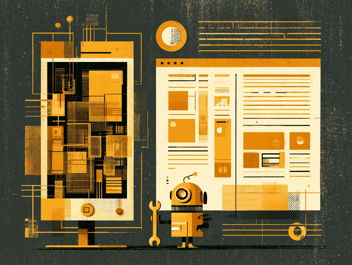
The most common cause is treating mobile as a collapsed version of desktop. Stacking three columns into one column does not make a layout mobile-friendly. It makes it a very long, very cramped version of something that was designed for a different screen.
Mobile needs its own layout. Re-prioritize what appears first (the most important content on desktop may not be the most important on mobile). Tighten spacing to 60 to 70% of desktop values. Make every button at least 44 pixels tall so thumbs can actually tap it. Redesign the hero section for portrait orientation.
One specific trap: hero images that work beautifully on desktop often reduce to a barely visible background wash on mobile. The image creates emotional connection and warmth. When it vanishes, the visitor gets cold text on a flat background. Design the mobile hero deliberately instead of letting CSS decide.
Test at 375 pixels wide (iPhone SE). That is the tightest common constraint. If your site works there, it works everywhere. If not, the mobile experience needs rethinking.
Topics
Want to see these systems in action?
Start with a conversation. We will walk through how these workflows apply to your business.
Get your AI Roadmap