Your Portfolio Page Is Hurting Your Credibility (and How to Fix It)
Plain screenshots in a grid look like a file browser, not proof of quality. If your portfolio section is not art-directed, it is undermining the very expertise you are trying to demonstrate.
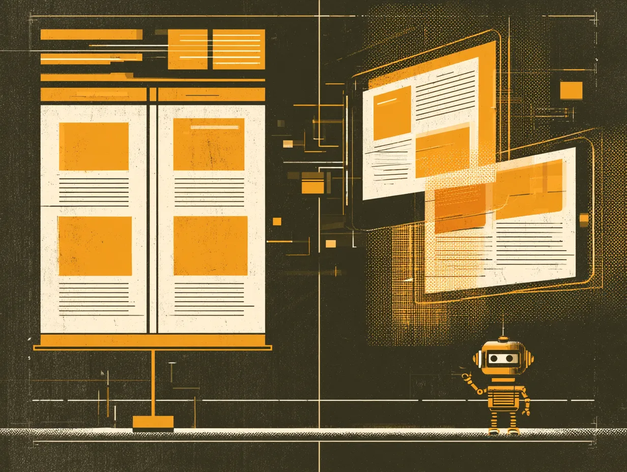
Your portfolio page is the strongest proof that you care about quality. It is where potential clients go to decide whether you are worth talking to. If that page is just rectangular screenshots arranged in a grid, the implicit message is "we organized some files," not "we create experiences."
Device mockup frames, perspective tilts, overlapping compositions, or gradient masks all elevate portfolio presentation from functional to compelling. The portfolio section should be the single most designed section on your website, because it is the one where your work has to sell itself.
One before/after comparison with measurable data (load time, mobile score, search ranking) is worth more than ten screenshots. Prospects do not just want to see what you built. They want to see what changed because you built it.
Topics
Want to see these systems in action?
Start with a conversation. We will walk through how these workflows apply to your business.
Get your AI Roadmap